Monday, May 28, 2012

Arthurian Alphabooks: B is for Belakane

Belakane (aka Belacane): Queen of Zazamanc, wife of Gahmuret the Angevin, and mother of Feirefiz —who is himself the half-brother of the eponymous hero of Wolfram von Eschenbach's Parzival, where Belakane appears. (Zazamanc is a made-up land somewhere in the Middle East, not far from Baghdad, apparently.)

I wanted to include Belakane in my alphabet in part to thwart an all-too-easy tendency (for me) to fixate on the knights of Arthurian literature and legend, given that many other very interesting characters aren't knights at all (even if, as is almost unavoidable in Arthuriana, they have close ties to knights or knighthood). Belakane is also very unusual among non-Christian women of color in medieval European Christian texts. While the narrator makes frequent mention of her dark complexion by way of contrast with the conventional blond standard of female beauty in medieval romances, he also declares that she is thoroughly beautiful. Furthermore, several other romances that feature love affairs between pale Christian knights and dark-complected non-Christian queens or princesses all too frequently transform the heroine by not only converting her to Christianity but by blanching her skin tone (that is, if she isn't already pale in comparison to her dark brethren, a contrast taken as a token of her inner readiness to convert).

Belakane does suffer for her non-Christian confession—her husband loutishly abandons her with no notice while she is twelve weeks pregnant with their child, on the pretext that he now has misgivings about marriage with a non-Christian. But she isn't literally whitewashed, and she is one of several non-Christians in Parzival who are treated with a sympathy that is atypical of European medieval texts from Christendom, let alone a text as saturated in Christian matters as Parzival (which is a story of the Grail in its religious guise—though it's also in the guise of a magical rock, which, again, is atypical).

Not too many art notes this time: I was in a hurry to get a drawing done after the end of Shavuot but before midnight (which is bearing down on me as I type), so this drawing was the first go. I began the penciling with reference to a photograph of James Baldwin, believe it or not, because the image on the cover of my edition of Notes of a Native Son has a really arresting contrast of light and shadow which I have more or less transferred to Belakane.

One of the only details that Wolfram provides by way of description (other than saying that Belakane's skin is dark) is that her crown consists of a single ruby. I'm not sure how that works, so I've just crowned her crown with a very large jewel.

As for her mantle, what may look like random squiggles is more deliberate than it appears, because my splotchy spot blacks are meant to pick out a pattern of intertwining hearts and anchors that alternative their orientation up and down, up and down. Why hearts and anchors? Because the emblem of Gahmuret, the husband who abandoned Belakane, was an anchor, but Belakane loved him all the same.

Anyhow, that's my B drawing for the Arthurian alphabet. I was this close to drawing Balin (possibly with his brother Balan), but changed my mind at the last minute. Maybe I'll save them for an Alternative Arthurian Alphabet...

Alphabooksbeasts: B is for Bobo

For this week's non-Donjon Alphabooks character, I'm choosing a little chimpanzee who has recently become dear to my heart.

This week, B is for Bobo.


Maybe you've never heard of this cute little guy. I had no knowledge of him before the last few months, but now I sort of adore him. He's the star of three picture books: Hug, Tall, and Yes. Hug is a current favorite around my house.

In it, Bobo wanders through the jungle and the savannah, gradually realizing that all of the other animals have someone to cuddle, and he's alone.


(Bonus: sequential images. "Where's Bobo?" is an interesting question for this two-page spread.)

When his loneliness finally takes over, Bobo lets out a tortured barbaric yawp (which is also the word "hug," but in huge wavy letters), then settles down amidst the other animals to cry to himself.


Don't worry; the story has a happy ending. Bobo's mother finds him, and there are several really happy hugs at the end of the book.

I know it's sappy and a little too sweet, but I think Jez Alborough's cartooning is fun, and the colors in the book are gorgeous. I have read this book at least once a day for the past several months, and although the dialogue only uses three words, I am not bored with it. That's a strong endorsement, right?

Bobo was actually pretty hard for me to figure out, as a drawing. He's such a top-heavy little coffee-bean. I tried and tried. Eventually I got close, but I think copying Jez Alborough gave me something like my Mercer Mayer problem: these are just not character designs (or curves) that I would naturally come up with on my own.


Next week: a very ancient and fishlike smell.

Alphadonjon: B is for Boobooloo, King of the Olfs and Brock.


A week has gone by already? Well, here are two more crazy character designs from Trondheim and Sfar's terrific Dungeon comics.

 For this week's Alphabooks, B is for Boobooloo, King of the Olfs, and for Brock.


You may note that these fellows are both sporting the same belt and sword that Ababakar Octoflea was wearing last week. That's because they are, like Ababakar, both former wearers and wielders of the Sword of Destiny. Herbert the Duck, one of Dungeon's main characters, retrieves the Sword from Ababakar's beheaded body, and discovers not long thereafter that if anyone tries to take the sword from him — or if anyone merely touches his belt — Herbert will be transformed in a cloud of bones and ectoplasm into a previous wearer of the Sword, to avenge the transgression. (This is handy, because the sword won't let Herbert use it until he accomplishes three great deeds without it. Also, at least initially, he's quite a wimp.)

Anyway, Boobooloo is the first previous wearer of the Sword that gets summoned up, and he's a firecracker. Oh, he's small, but he's like a little basketball with fists and feet of steel. He shows up a few other times, including an extended appearance in one of the Monstres volumes set during the cataclysm at the end of the world.

As for Brock, well,

Now you know as much as I do. In the entirety of Dungeon, he appears in just one panel. But he's got a really fun design, doesn't he?

It took me a little while to figure this drawing out, mostly because I didn't know how these two guys would interact. Would they fight? They're like brothers in arms, because they're both wearers of the Sword. Maybe they'd high-five.


(You'll notice that at the brainstorming stages I'd forgotten that Brock was a snake from the waist down.)

Then I thought, "Okay, one guy is big and beefy, and the other one's a little berserker. Isn't there some sort of baseball metaphor for that sort of deal?"


Then it was just a matter of drawing. And taking away Brock's legs.

Next week, one more wearer of the Sword of Destiny, and maybe someone else.

Friday, May 25, 2012

Alphabooksbeasts: A is for archy

Okay, first of all, I officially retract that image of Aslan that I posted late Sunday night. I'm going to need to draw from Narnia later in my Alphabooks alphabet, and I wasn't too happy with the way Aslan turned out anyway.

 Actually, as it turns out, A is for archy, the free-verse poet reincarnated as a cockroach who cavorted on the keyboard of Don Marquis starting in 1916 (about seven years before e. e. cummings's first book, if you're keeping track of poets with odd typographical habits).


Maybe you've never heard of this poetical cockroach, but I first encountered him when I was a mere tyke, in a Time-Life book about insects and spiders that excerpted "archy declares war." (archy never uses capital letters, because while he is jumping around the typewriter he is unable to push down the shift key at the same time as a letter key. Kids, ask your grandparents about the medieval technology I'm talking about.)

I don't still have that book, and I haven't been able to determine for sure, but I think that same poem may have given me my first glimpse of the cartooning of George Herriman.


(I'm pretty sure this particular image did not appear in the book I had; I borrowed it from this blog post.)

You can get archy with Herriman cartoons here.

When I finally did see Krazy Kat during my undergrad days, maybe archy had to some extent made me ready for what I was going to see. For that, I thank the Time-Life company, I suppose.

I didn't want to try to ape Herriman for this drawing, though, in part because I'm planning to visit him later in the alphabet, but mainly because I know enough entomology (and have spent enough time with cockroaches) that I wanted to aim for a little more fidelity to the actual critter form. Here are some preliminary doodles.


I gave him boots in one drawing because I figured he'd need a little extra weight to get those typewriter keys to budge. They looked silly, though, so I gave him some leather shoes instead. The next doodle was pretty close to what I wound up with for pencils. In some ways, as usual, I like the sketch better than the finished inks: more energy, and a sort of scruffy quality that seems right for a cockroach.


If you're wondering what rules led me to pick and then reject Aslan, here are my personal guidelines for the AlphaBooks project:

1. I'm planning to do two alphabets this time, one of which will consist entirely of Donjon characters
2. For my other alphabet, as with Alphabeasts, I'm going to draw twenty-six characters from twenty-six different sources
3. None of my characters will be human beings. (Mostly they're animals. This is because I have been enjoying drawing creatures for the first two alphabet projects, and because my skills as a caricaturist are really still too minimal to be honed by a project like this.) 
4. That said, they'll all still be characters—that is, they'll have personalities that go beyond their natural animal qualities. (There may be an automaton or two in the list, but even they will be distinctive individuals.)

I've got the alphabet all planned out now (at last!), and I'm psyched to get drawing. Next week, we'll meet a little chimp, and not the one who spent time with the fortieth president.

Tuesday, May 22, 2012

A is for Almost Arthur: Abortive Attempts

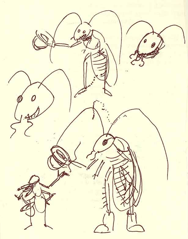
Isaac expressed some interest in my process drawings for yesterday's Alphabooks image of Arthur, so I'll post them here with some comments. (NB: If you are not interested in the minutiae of my drawing decisions, you may want to skim or skip this post—there are eight pictures all told.)

I started sketching loosely while thinking generally about the scene I wanted to portray, to see what sort of Arthurian face suggested itself without my trying too deliberately to draw something before my hand started moving. I don't have a scan of the pencils that resulted, but I have two different inked versions of those pencils. The picture below was my first attempt, drawn by tracing over the pencils on a separate sheet of paper—not tracing paper, however, so my view of the pencils was somewhat spotty. Nevertheless, this first drawing probably had the tightest inking of them all, with lots of bitty lines (maybe because I was trying to reassert my control of the brush after long desuetude):

 
The eyes were a problem, as you can see, and I can't really vouch for the mechanics of that brooch-thing. (I surprised myself by including the cloak and brooch, characteristic more of a Celtic-clad Arthur than the Frenchified/Anglo Arthur better known from mainstream medieval texts.) Arthur also didn't look mad enough, or tired and dirty enough. So I tried again freehand, and made this:

This one has its okay qualities, but Arthur seems too upset and not riled up enough. And again the eyes don't line up quite right, and they were a main concern of my effort to depict the conflicting emotions I wanted Arthur to express in a single face (rage/grief, exhaustion/resolution, the like). I also think this Arthur looks too old, and a bit too hairy. So I tried another one freehand, and made this:

A head-on view for a change—not altogether satisfying in its static quality, but I was trying to figure out how to arrange the eyes, eyebrows, and mouth, which I found to be the main expressive elements (duh, because they are a lot more mobile than, say, the forehead or the cheekbones or the chin and beard!). My sense was that, in order to capture Arthur's welter of emotions, I'd have to use a bit of asymmetry, with one eye more clearly angry (with a lowered brow, say) and the other more wounded or stricken (wider, perhaps), while the two corners of the mouth might bend differently, expose different amounts of teeth, etc. I also found I kept wanting to give Arthur a busted lower lip, though I didn't always draw it that way. This Arthur probably looks too young, to boot. But note that these freehand drawings have started to get freer with broad strokes of the brush—that was going to be the way forward, ultimately. But I wasn't there yet, so I had another go at inking the original pencils—inking them directly, this time, while still trying to use them as a loose guide rather than a firm directive. Here's what I came up with this time:

So this one (#4, if you're keeping score at home) is clearly close kin to the first, though I think this one is more successful. Arthur looks a bit more bedraggled, more angrily wary and less innocently startled. The big problem with these sibling pictures was the spacing of the eyes relative to each other. I tried to make corrections in ink (more evident in #1 than here)—an effort doomed to failure! But here again there are some nice fat swatches of black brushstrokes, in defining the hair especially. (And since I was using real waterproof India ink on a bristly brush, as opposed to the water soluble ink in the cartridges that I load into my brush pen, the black looked really nice on the page.) I was almost satisfied enough with this to send it to Alphabooks, but it still has an amateurish quality that bugged me. So I tried another one freehand, and made this:

Truthfully, this was more a facial study than a full-out effort. (I think its placement on the page relative to prior drawings meant I couldn't have finished the head even if I'd wanted to.) Here I was still trying to figure out how the essential expressive parts of the face needed to work. I kind of like this piece of Arthur, though it's too fragmentary to be really recognizable as Arthur without a label. (I am aware that the same could be said of the final drawing I posted to Alphabooks, however.) I thought I was getting closer to where I wanted to be, but I was still willing to try something a little different. So I tried another one freehand, and made this:

This one didn't work either. Like #2, it looks too old and too mournful—nowhere near angry enough. (This one might work for the earlier scene of Arthur on the field of battle against Lancelot in Benwick, when his heart is no longer in the fight and when he realizes just how far he has compromised his principles in going along with Gawain to wage war against his former best friend and lieutenant; the key scene for Arthur's realization is when Lancelot himself rehorses Arthur in the midst of the battle, an act of transcendent chivalry that baffles and frustrates Lancelot's allies even as it breaks Arthur's heart. But I digress!) The other reason why this one doesn't work is that it looks too much like Uncle Jesse from The Dukes of Hazzard. That would never do!  So I tried a much different tack, and made this:

I don't really care for this one, but it helped to draw a more youthful Arthur again, and I made at least a sketch of what he might look like in a crown, though you will note that the crown was an afterthought, added after the hair was sketched in, and I wasn't prepared to commit fully to a complete design. Also, it sits weird on the head. Also, the head itself is kind of weird.

One of the problems I faced throughout, besides the problem of how to convey Arthur's mixed emotions, was getting the age of Arthur where I wanted it. I think he looks too young in numbers 3 & 7, and too old in numbers 2 and 6. I actually like a lot of the fundamentals of 1 & 4, the images based on my original pencils, but the eyes were really bugging me, and I think I prefer a more broken nose in Arthur, and a head that's not quite as square as those are (though I'm not convinced that the one I went with for the blog/tumblr/Alphabooks isn't too long in the face).

And heck, for the sake of comparison here's another look at the one I finally settled on, sketch #8:

There's a Knight of a Dolorous Countenance for you!

Monday, May 21, 2012

Arthurian Alphabooks: A is for Arthur


As a card-carrying member of the International Arthurian Society (or, well, journal-receiving; we don't actually have cards), I have decided to attempt an Alphabooks alphabet that is altogether Arthurian. There are lots of options for many of the letters. A, for example, could be Agravain (troublesome brother of Sir Gawain), or Anna (one of several names attributed to Arthur's sister, or at least one of his sisters), or Accolon (who attempts to kill Arthur in a conspiracy with Morgan le Fay), or Amfortas (a Grail king). But come on—it's obviously got to be Arthur, though the image below may not obviously look like Arthur to you:

 
In fairness, it's not obviously Arthur to me, either, though I think it qualifies as an Arthur. One of the reasons I thought it might be interesting to attempt an Arthurian Alphabooks is because descriptions of characters are often limited, absent, or so conventional as to be unspecific. Another challenge is that some of the more prominent characters feature in decades' worth of narrative events, so that a drawing of Arthur needs to choose a particular age of Arthur: the boy ignorant of his patrimony (in most texts), the young king (who may or may not be bearded), the mature monarch, the dying warrior.

I wanted to focus on not just a particular age of Arthur but a particular moment, when, on the field of battle at Salisbury Plain, he catches sight of his traitorous son Mordred, still alive when almost everyone else has fallen. I made a number of attempts, which were interesting to me in two main ways: first, I discovered that I did have a basic sense of how I thought Arthur might look; second, I realized how devilishly difficult it was going to be to capture in a still image the range of feelings that I imagine Arthur to experience in that moment.

Anyhow, the drawing above is neither exactly what I thought Arthur might look like nor (even remotely) a successful rendering of a face that should register simultaneous regret, rage, hurt, hostility, etc., etc. (An actor would have better luck than a still image, I think.)

Still, I'm satisfied enough to post it here and to have sent it to the good folks at Alphabooks. I will also note that this drawing is the furthest from my original sketches, which were a lot tighter and controlled—and frustratingly stiff. This one I drew freehand with a brush heavily charged with ink, and I began with loose strokes focused on the hooded eyesockets and the drawn cheekbones. (In fact, the original sketch lacked visible eyes, relying just on the solid black area of the upper lids.) I then slowly built up the image, even turning the paper around several times to hold up to the light to check for symmetry and tones. It felt almost like sculpting in ink, and was a fun way to get reacquainted with a real brush dipped in real India ink. (I haven't used those tools in about eighteen months or more.)

Anyhow. My thanks to Isaac for single-handedly keeping the blog alive in a really rewarding fashion over the last long haul. Let's see how or whether I hang in there this time around.

AlphaDonjon: A is for Alcibiades and Ababakar Octoflea

I'm hoping that I will be able to draw one entire Alphabooks theme from the collaborative Dungeon comics (Donjon in the original French) co-authored by Lewis Trondheim, Joann Sfar, and a bunch of other great French cartoonists.

If you've never read any Dungeon at all, you can get started here.

In the very first volume of the series—indeed, by page four—you will meet two relatively minor characters whose names start with A:
That's Alcibiades the Gnomonist there at the bottom, who can normally be found managing the network of crystal balls that the Dungeon employees use to communicate.

Attacking him is Ababakar Octoflea, Prince Without a Principality, Whose Sandals Stomp on the Tombs of Kings, bearer of the Sword of Destiny. He dies a brutal death on page five.

But his death opens the path of heroism that defines the life of one of the series's main characters, and because of the weird chronology of the Dungeon books, you can also meet Prince Ababakar Octoflea in the first volume of Dungeon Monstres.

Alphabooks: A is for Aslan (redacted)

So: the next big alphabet project is going to be characters from books.

My plan is to draw characters from twenty-six different sources again, plus one twenty-seventh source that I'll feature in a separate post. As you may expect, my plans are a little more complicated than that, but my desk has been in such a jumble this month that I'm not sure how well the plans are going to come together.

Possibly it's best for me to say no more about them for the time being.

Meanwhile, if only to keep my foot in the door, here's a leonine Christ-figure:


A is for Aslan. If this guy looks familiar, it might be because of a theory of mine:

I don't have a way to prove this, but I think lions must have, as a species, the highest ratio of sculptural representations to real living specimens of the species. (Extinct and mythical species must be excluded from the calculation, of course.)