Wednesday, September 29, 2010

Quick Post: Chester Brown Monkey Doodle


I asked for this quick sketch at MoCCA in 2004.

I'm busy with other things at my desk, but I didn't want you to think the blog was going into silent mode. I'll be posting again once I hit a deadline for some writing that's a bit less ephemeral than the blog (knock wood).

Friday, September 24, 2010

What Have We Been Reading? #4

Two versions of a panel from something I've been reading this week:

The first, which is what's in my notebook:


The second, a bit more faithful, thanks to some Photoshop hoodoo:


(Click that one to observe the halftoney faithfulness.)

Recognize it? It's from something really great.

Thursday, September 23, 2010

The One-Panel Critics: The Peril of Art


That's a little envelope doodle that appeared in my mailbox this week from New Zealand. Dylan Horrocks has a new minicomic!

You can order your copy using this link (and Paypal).

It's a "conversation jam," similar to those Kochalka/Thompson and Kochalka / Brown conversations that Top Shelf published, between Horrocks and the writer Emily Perkins. In their conversation, Horrocks and Perkins start with the question of why we write stories, and the talk drifts pretty quickly to Horrocks's anxieties about whether fiction (or any story) can really tell the truth about living.

"We're still in thrall to narrative unity ... resolution and catharsis," Perkins says. "Maybe the lie is not in metaphor but in structure."

Horrocks replies:


I'd argue that metaphor and structure don't need to be easy or simple, but I can see why Horrocks has some anxiety about this.

It's is actually a topic we've been discussing in my graphic-novel course, relative to Maus and the implicit structures of memoir: from the perspective of Rego Park, it's easy to construe Vladek's survival as a story of resourcefulness, smart decisions, necessary ruthlessness and scrupulous generosity. But while those events are being lived, there's no way to assess their value or their wisdom: Vladek could have made the same decisions, or other decisions on the same principles, and not have survived after all. It's only the post-facto construction of a story (or the opportunity to reflect and construct such a story) that makes Vladek heroic.

And there are elements in the logic of such a story that deceive, in some fundamental way, about lived experience. In the case of Maus, Vladek's story might seem to imply something about the capability of a wily and resourceful person to survive the Holocaust; this would in turn imply that the millions of victims had failed, in some way, to rise to heroic levels of self-preservation. Objectively, we'd never say that about the Holocaust victims, but something about the nature of narrative implies it anyway, contrary to anything we (or Spiegelman) would want to believe.

(Did I just run afoul of Godwin's law?)


It isn't merely that reality has too many details to fit into a comics panel, or that too many events take place for a memoirist to represent them all. The problem isn't simply one of completeness. It's that the structures of literature (and, as some might argue, even the structures of memory) necessarily distort reality, and in ways that we should probably find alarming: not distortions of fact, but distortions of the value of facts; structures and analogies of meaning.

Of course, maybe we could argue that until these distorting structures of narrative, analogy, and value are used on the materials of experience, there's no way to assess meaning at all. "We [tell] [stories] lest we perish from [inconsequentiality]; we [create] [structure] lest we perish from [chaos]."

Or something like that.


Thanks for the thought-provoking mini, Dylan. (And for the envelope doodles!) Everyone else, why not order a copy? It's smart stuff.

Wednesday, September 22, 2010

SPX Find #5: Laura Terry's Thousand Lies

Here's one of my favorite things from the SPX minicomics stack so far:


Laura Terry is a recent graduate from the Center for Cartoon Studies, and based on One Thousand Lies, I'd say I'm looking forward to seeing more comics from her.

One Thousand Lies is a story about a wanderer named Arnold, as he checks in with his godmother, a high-power lawyer named Victoria. Arnold convinced Victoria to take him out to lunch, and in return she asks him to tell stories from his travels.


(Let's hold on to that intersection between stories and lies until tomorrow. I have another post in mind.)

What Arnold comes up with are three odd vignettes, each of which takes place in a town with its own skewed logic: Sunderland, where philosophers congregate on the jungle gym and love waits in the morgue; Buffalo Gap, where half of the population is transient; and Enoch, which has been designed to capture and reflect the harmony of the universe.


There's a bit of The Thousand and One Nights in this premise, even if Arnold is singing for his supper instead of to save his head. (The connection is strong enough that I wondered why the lies in the title fall short by one.) There's also more than a little of Italo Calvino's Invisible Cities in the imagination of each peculiar geographical vignette. It's not hard to imagine this book being extended into more chapters, each of which would have three or five stories of improbably towns with puzzling problems.

It's also really nice to sense so clearly that the cartoonist reads something other than comics. I mean, I know that comics are the best place to learn to make comics, but to extend the medium, or to stretch a genre, the cartoonist needs to know what's beyond his or her most immediate antecedents. Won't the best stories always come from people who read lots of kinds of stories?


I also feel a lot of influence from Matt Madden behind this book. I might just be imagining that because Victoria looks to me a little bit like Matt's character Lance (from Odds Off—you know, the guy whose writing catches "word lice"). But there's also something about the cheery, intellectual familiarity between Arnold and Victoria that reminds me of some of Matt's other characters. And of course the appeal to Calvino and, behind that, Scheherazade is something that would appeal to Matt.

Anyway, I liked this book a lot, partly for its promise, and partly for what it delivers. There's some nice, solid cartooning here, but the real interest is in the story, and in the process of storytelling.

If I had to mount a bit of conservative criticism, it'd be that the scenes between Arnold and Victoria seem to drag a little bit — I'm not sure whether they could be compacted from two six-panel pages each down to a single eight-panel page, for example, or if the splash-page transition could be turned into a half-page panel with some editing — but that's really a minor misgiving about what's otherwise a fun, interesting, smart, and attractive minicomic.

I'm hoping to see more from Laura Terry.

And lo, sure enough, here is more from her, courtesy of my robot doodle book:


Thanks, Laura! I hope you'll let me know when your next comic is ready!

Tuesday, September 21, 2010

New Halloween Comic, Early Stages

You probably won't hear much more about this until it's finished, but I'm planning a little micro-minicomic for Halloween. Probably it'll take a little more time than carving a pumpkin in some crazy way, but I can't seem to stop myself.

Here are some early doodles toward a character design. I worked out a script last night. One hint about that is all you get.


When the comic's done, it should be a good size to hand out to kids on Halloween along with (or in lieu of) candy. If you get trick-or-treaters, and want the comic, I'll figure out a good price for a "bulk bundle" that I can mail in time for distribution. When I have a few done, I'll put the word out here on the blog.

What motivated me to do this, when I've got essays write and papers to grade? My own foolishness, obviously, but also a really fun-sounding project that Colin Tedford announced yesterday on the Trees & Hills blog.

And what is "Trees & Hills," you might ask? Colin's doodle from my robot sketchbook will answer that question:


Thanks, Colin. I'm looking forward to this.

More SPX minicomic reviews tomorrow!

Monday, September 20, 2010

What We Have Been Reading #3: Britten & Brülightly

Back before SPX, I posted a mystery panel for the third "What Have We Been Reading?" post, and no one has guessed it yet. But before I move on and write more about the minis I got at SPX, I thought I'd go ahead and say what I have been intending to say about the source of that image.


Britten & Brülightly came out in 2008, the debut graphic novel by Hannah Berry. It's a noir detective story set in London, featuring Fernandez Britten, an Ecuadorian detective who looks French, and his business partner, a talking teabag. (I appreciate the fact that the teabag, which only speaks to Britten, is neither explained nor marked as unusual. It's one of a few touches in the world of this book that make it feel off-kilter and seedy.)

I'm not sure how to rate the mystery plot in this book. On the one hand, I guessed the lynchpin detail of the plot as soon as the first clue about it dropped, but then the book did a good job leading me off the trail with red herrings, so that soon I wasn't convinced that I was right after all. I don't read a lot of mystery novels, so I don't know whether this counts as good practice or bad practice. I felt a little cheated when I saw the blocks slide into place, but that might just have been because I had a hard time following the storytelling in the climactic showdown.

When I drew my swipe panel, I said there were a couple of things about the book that I didn't like. One of them is the lettering.


I know I was complaining about computer lettering yesterday, but this book is having sort of the opposite problem: hand lettering that isn't steady or legible, and draws attention to itself in an unfortunate way. Speech balloons appear in an untidy all-caps hand, and Britten's narration is in a script that is at times genuinely hard to read:


I don't mean this as an insult to Berry, but because I know the lettering has been bothering me, I want to take a look at it in detail, to figure out what about it isn't working. After all, I teach this sort of thing on occasion, and I want to be able to give good advice to my students. Have a look at this balloon, enlarged from the size at which it appears in the book, and see whether you spot any problems that I don't mention:


So: for starters:


I notice that the letterforms aren't very consistent. Look at the two versions of B that appear in this part of the balloon, or the two Ls.

A lot of the letters are made in a single loose stroke (with no strong angles) that tends to open up and lose its shape, like the B in BE or the N in BRITTEN.


There's not much consistency in the proportions of the letter parts. Look at the way the bulb of the R dominates the letter in REALLY, compared to the one in HEARD. Notice the way the proportions of the E shift, too.


A lot of the letters, as part of their basic form, contain a C-shaped swoop, so that when you pile a lot of Rs, Es, Cs, and Ss together, it's really sort of hard to distinguish one letter from another.

My first reaction to this lettering is that it's been done by someone who doesn't often write by hand, and who rarely prints in all caps when she's not lettering a comic. It doesn't feel as regular and natural as handwriting, and it's not as legible as it could be.

It also doesn't mesh well with the drawing in the comic, which is much more controlled and natural. Maybe that uneasy fit is partly a question of drawing medium: the images are in a fairly lush range of watercolors, and there's no lettering equivalent for that. Would the letters look better if they were in good dark ink, though? Blowing them up for this examination suggests that there was an interface problem between the tooth of the drawing surface (watercolor paper?) and the pen used for inking (a fiber-tip pen?), but I'm not expert enough to say for sure what's making the edges of the letters so fuzzy.

The other main thing that bothered me about Britten & Brülightly was the character design.


Most of the characters are all cheeks and nose, so their heads are dominated by features that don't move and aren't expressive. Most of their heads end right behind the ears, and their eyes are way above the vertical halfway point on the skull. Given the realism of their environments, I found these caricatured distortions distracting. Moreover, since most of the characters' heads had the same distortions, it was hard for me to tell the characters apart. In the climactic scene, I needed to be able to recognize both of the characters revealed in the bottom panel here:


... but I was honestly confused. Had I seen those noses before?

I didn't hear much about Britten & Brülightly when it came out, and I'm not sure what sort of critical reception it received. I don't mean to make it seem like I hated the book. In fact, there's a lot I like about it. But I can't help wondering what it would have been like with a more practiced lettering hand or a somewhat more practical sense of character design.

Sunday, September 19, 2010

SPX Find #4: Keny Widjaja's Fantasy Worlds

When I approached the Center for Cartoon Studies table at SPX, my friend Robyn Chapman suggested that I get Keny Widjaja to draw a demon for me, and I picked up what looked to be the last SPX copies of a couple of Keny's minis:


Of the two, Tales of Rodentia is the more recent, and also the more polished-looking. It's the first chapter in what looks to be an epic about the conflict between small rodents and their predators in a world where these creatures talk, wear clothes, and use tools. (It reminds me a little bit of Mouse Guard in this respect, though Widjaja's world seems more busy, and his concerns seem closer to social satire.) A village in Rodentia is under threat from predators, and a caravan of devotees of a central monotheistic (and possibly corrupt) church arrives to save the town.

There's a lot to like in this book. The cartooning is lively and loose, the world is expansively imagined, and the plot is complex without being difficult to follow. I'll be wanting to read further installments, for sure, though I have a few caveats and nits to pick.

First, as with the mini by Tyler Hutchinson I looked at yesterday, this comic looks a lot better online than it does on paper. There's a lot of Photoshop gray in Widjaja's online version—and maybe some pencil shading, too—that gets muddy in halftone screens for xerox reproduction. If you click over to the online version and flip a few pages, you can compare that to this:


Although that's a two-page spread with some really interesting drawing in it, most of the work of the drawing gets lost either in the halftone grays or in the bold camouflage pattern of the trees in the "metapanel" background. It's hard to look at the four smaller panels on that page, really. (It's also hard to know what order to read them in, though that doesn't matter much. Still, extending the first panel past the page crease would have helped to indicate that the next panel is the one to the right.)

Look at what you miss by not being able to read those panels clearly:


Our travelers, escaping from a hive of massive white ants!


Cute critters ducking past the carcass orchids, noses held!

My other major qualm about this comic is about its lettering, which is all in a computer font that, while fairly attractive, doesn't do a great job imitating hand lettering, and—especially when there's a large block of it—starts to look more like "presentation text" than "comics speech." Also, because the art within the panels has so much softness (in those halftone grays I mentioned before), the hard, precise computer-lettering forms really stick out sometimes, and keep the speech balloons from seeming to be part of the same surface with the drawings.


On the other hand, if Widjaja is going to letter with the computer, there's really no excuse for him to have punctuation errors in the printed comic. Getting his apostrophes in the right place should be only a little more difficult than getting someone else to read the comic before it's printed.


But I don't want to make it seem like I didn't enjoy Tales of Rodentia. It's just that I can see some of the signs that Widjaja is still learning and developing, as a cartoonist, and I hope that he'll pull some of these things together in the years to come.

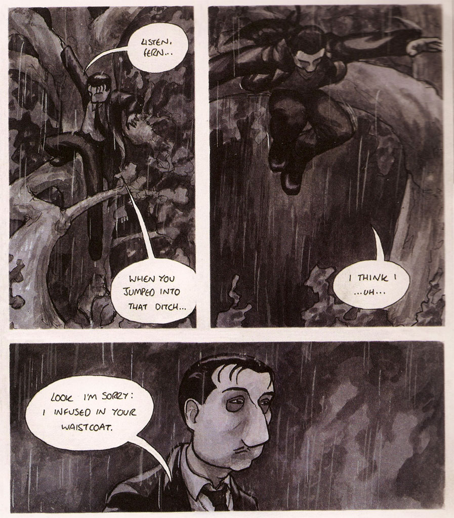
Jester's Odyssey is an earlier comic, and doesn't have the same problems of translation to the printed page, because it's all done in solid, easy-to-photocopy black ink. It also seems to be a more personal comic in some ways, though the material is still firmly set in the swords-and-sorcery fantasy milieu.

As with Tales of Rodentia, there's a lot of visual inventiveness and fun in this book.


Are those ogres in the first panel Charlie Brown and Linus?


It's interesting to see how much Widjaja's drawing style changed over the course of a single year. Jester's Odyssey is looser, almost scribbly in places, and more energetic. (Also a bit harder to read, in places, because the scribbly lines obscure some of the forms of characters and objects.)


I'm not sure whether both of these stories will really see second chapters. Judging from his blog, Keny has moved on to another project, at least for the time being. And if I had to choose which one of these two stories I'd like to see more of, it'd be hard to pick. On the one hand, Rodentia has a lot more plot momentum, and I really like looking at it (especially in its online version); on the other hand Jester's Odyssey feels like it has more behind it, somehow—as if it might be capable of going to dark and poignant places that Rodentia would have trouble finding.

Oh, and I think I mentioned that Keny drew a demon for my sketchbook at SPX ...


This doodle has me really looking forward to Keny's Rangda comic.

Saturday, September 18, 2010

SPX Find #3: The Adventures of Tyler J. Hutchison

One of the things I try to do at SPX is to pick up a few minicomics by people whose work I have never seen before. I figure it's part of my task as a critic to search out the best new work, even if it's coming from somewhere unexpected. That means I often come home with a lot of stuff that I want to recycle right away, but it also means that I see new and interesting things I couldn't have anticipated.

It also means I have a lot of minicomics I feel ambivalent about. What if there's something amusing but crudely drawn, or a moving story with C+ storytelling? What if there's a pompous mini with grand intentions that just fails to deliver, or an improvised, loose, and silly comic by someone who could do better?

I'm of two minds about The Adventures of Tyler J. Hutchinson.


On the one hand, it's a fun little mini, jam-packed with amusing incident. Its sense of humor seems to be positioned somewhere between Scott C. and Scott Pilgrim (two of the better Scotts in comics, leaving aside the question of Scotsmen in comics). Ghosts hang around at a party in the woods wearing backwards ball caps and calling each other "bro"; when Tyler kills a troll, a visible graphic displays the increase in experience points, and text screens reveal what's added to his inventory.

There's a good deal of random, silly, improvised-feeling humor in this comic, and I'm certainly in no position to complain about that. When Tyler receives a quest to locate a dead wizard's favorite hat, he imagines what he'll be able to do once the magic hat is his:


That's a pretty fun sequence, and I can tell it was fun to draw. Click to enlarge it.

When he does finally find the hat and the monster that stole it, things are certainly not as we would have expected:


Can you see the hat?

... And yet, I'm even of two minds about the goofy humorousness of this story, since it basically leads Hutchinson off chasing whims, and keeps the story from really feeling like it has a resolution (since the story has so little shape). Will Tyler return to the tree that gave him such fateful instructions at the beginning of the story? Will he claim the treasure by killing the ghosts? These questions are important in the mini's first few pages, but they fade away in favor of other issues. Will he be held accountable by the troll's family? What happens to the fratboy ghost who slips himself a roofie? The comic doesn't conclude so much as merely end. I know Adventures isn't expecting me to care about this, and yet I can't help wanting the book to feel more structured, because it's in the form of a book.

The story also exists in its entirety online, and it might feel more natural (and more satisfying) in that format, which implies looser structure and less terminal closure at the end (where more pages can always be added on).

On the web, you're also going to see these pages at about twice the size they appear in the mini, which helps Hutchinson's art retain its legibility. He works with a lot of faint and thin lines, and those haven't translated very clearly into the minicomic I brought home from SPX. (It's small, only about 4" x 6": see my fingers in the first picture?)

Some of the images that were designed for the screen get pretty muddy on the miniature page, even though there's good drawing underneath them.


(Compare this page before and after clicking to enlarge it.)

So, in the end, I think The Adventures of Tyler J. Hutchinson is a fun, silly comic that does some interesting things with the conventions of adventure fantasy. (My favorite thing about it, actually, might be that it announces itself as a "journal comic" full of "very personal life stories" without containing anything set in the real world.) I'm glad I've read it, but I'm not sure I'd recommend it wholeheartedly. If nothing else, however, you can read it for free online, along with Hutchinson's other amusing comics, so if you've got the time and inclination, follow that link to check it out.

Since I didn't get Tyler Hutchinson to draw a sketch for me at SPX, I've decided to end this review with a different sort of bonus: a little bit of "fan art" I doodled up, featuring his frat-party ghosts:

Friday, September 17, 2010

SPX Find #2: Cathy Leamy's Reggie & Brian

Here is my comics pal Cathy Leamy, at this year's SPX:


And here is a closer view of the cover of her newest mini, Reggie & Brian and the Lousy Nickname.


In it, Reggie is a fisherman, perhaps on the Irish coast—he and his fellow fishermen all wear those cabled wool sweaters one associates with Ireland. And Reggie, by far the youngest of the bunch (the only kid in a crowd of grizzled old guys), is tired of being known merely as "Reggie": all his compatriots have nicknames.

His boss thinks it over ...


... and gives him a new monicker:


... but he really doesn't like being called "Crusty," because it's a little embarrassing to have barnacles all over your boat no matter how much you clean it.

Once he's out at sea, Reggie tells his friend Brian (a young merman) about the new nickname, and the barnacle problem, and Brian offers to try to find a solution.


It turns out that Brian can speak the language of barnacles, and he teaches it to Reggie so that Reggie can get them off his boat and earn a new nickname.

I'm not going reveal more about the story, because the final panel is a punchline. In fact, the whole comic is structured like a story-joke, and thinking about Reggie & Brian made me realize that I know a few jokes that would also make pretty good comics. (The one about Einstein's first words would be a good one, for example. Also, maybe the one about the Indian with the World's Greatest Memory.) No telling when I'll find time to draw them, but I suppose that's an idea for a rainy day.

I enjoyed Reggie & Brian, in part because I enjoy the unpretentious friendliness of Cathy's drawing style: it's direct, and very clear, without losing a sense of personal voice or style. I am also happy to add it to my growing pile of kid-friendly minicomics: it's good to know there's more stuff out there that one wouldn't have to hide from a little one.

I'll admit to feeling like Reggie & Brian is sort of slight — the sort of thing that might have been only one story in a longer issue of Geraniums & Bacon, Cathy's serial anthology. It's a sixteen-page story, but it feels short because there's only one page with more than two panels on it: the pages go by quickly. I didn't ask Cathy about this, but I imagine she might be trying to imitate the pacing of a children's book, or to make the book more friendly to early readers.

At any rate, it's a fun little book, and the punchline is pretty funny, too. (I think I had guessed it before I saw it, but that's not necessarily a flaw in a story-joke.)

If you want to get a copy of Reggie & Brian to find out the punchline, you'll find it, along with a bunch of other entertaining minicomics, in Cathy's online store.

As an extra bonus, here's a doodle Cathy put in my dress-your-character-as-a-superhero sketchbook:


That's her own autobiographical persona dressed as Phoenix. Such fun!

Wednesday, September 15, 2010

SPX Find #1: Shawn Cheng's Counting Comics

I've had time to unpack from my SPX trip now, and I'm starting to sort through the minicomics I obtained there. My plan is to read them slowly, and to write about them as I go, rather than burning through the whole pile in a weekend the way I have in the past.

The first books I have to hand are a couple of sweet little gems from my former student, the Partyka stalwart Shawn Cheng.


Shawn had a couple of new-to-me minis at SPX, both of which have a really pretty opalescent cardstock for covers. They're obviously meant to work as a pair to some extent, because they both feature appealing, stylized drawings of creatures and events from classical mythology, and because they're both set up as counting books. That is, each illustration accompanies a counting number and illustrates some countable detail. It's like an alphabet primer for numbers—a genre we're all familiar with from childhood.

So, in The Numbers of the Beasts, "One is the eye of the Cyclops, Two are the horns of the minotaur," and ...


Three are the necks of Cerberus. You can see a little bit of Shawn's participation in The Road of Knives in these monster drawings, but by and large they're much smoother and much cuter than the drawings in that project.

In Hercules Counts to XII, rather than the parts of mythological creatures, we're counting things from the twelve labors of Hercules, like this:


Five brooms for the Augean stables.

I think Shawn's doing some of his most appealing cartooning ever in these books. The curves of his forms are friendly, stylish, and cute. The objects and animals are stripped down to really basic forms without quite losing the stretchy eccentricity that I associate with Shawn's earlier drawing.

Count those nine kisses for the belt of Hippolyta!


She cuts an intimidating figure, doesn't she? She looks ready to administer a death by snoo-snoo, yet it's the icky kisses that Hercules recoils from. That's a good sign that these are genuinely kid-friendly books, and in fact they're clearly designed for kids, except in that minicomics are probably too flimsy to survive long between the grubby fingers of your standard pre-schooler. If I were a children's-book publisher, I'd be pressuring Shawn for color versions of these cartoons so we could put them between hard covers and charge four times as much for each book.

And look at the graphic-design chops evident in these highly simplified drawings:


I admire the way the figures in Shawn's basilisk drawing ("Eight are the legs...") fill each other's negative space, yet still overlap enough to create depth of field. It's a smart bit of composition, and each of the drawings in these books takes that kind of visual knowhow for granted. I asked Shawn about the change in his drawing style, and he said that these simpler drawings actually take him longer to execute, because everything has to be carefully planned. Looking back over these books, I can easily see what he's talking about.

The Numbers of the Beasts and Hercules Counts to XII aren't in the Partyka store as I write this, but I imagine they'll appear there before long.

Meanwhile, as an extra bonus to this review, here's a sketch or doodle Shawn did for me at SPX, with his characters Whiskey Jack and Kid Coyote (from a different minicomic) dressed as Cyclops and Wolverine.


Thanks, Shawn! Stay tuned, gentle reader, for more minis from SPX.